Origins & Inspiration
New Leaf is an eco-friendly stationery company that was inspired by the idea of having a product that both aides in saving the environment while also playing a part in making the world more beautiful. The products are made of biodegradable seed paper and are made from 100% recycled paper which (after planting), grows into various flowers and herbs. Once these plants bloom, the company is able to use these new seeds to create new products.
New Leaf strives to help the environment through many eco-friendly and reusable products. From the paper to the canvas pencil pouches, the products makes its most meaningful impact when they are planted.
Category: Packaging, Branding, Illustration
Tools: Photoshop, Illustrator, Invision

“New Leaf provides eco-friendly stationery products as well as educational outlets to those who care for the environment in a friendly and welcoming space. Helping them feel empowered to do good and be more consciously aware of their own environment”
Logotype Development
Icon Based
One of the icon based logotypes that was explored focused on a three leaves icon representing the three stages of the products.
Handwritten Approach
The handwritten logotype approach was explored because of the “all natural and organic” position of the brand. The curves and flow of the type expressed this aspect.
Imagery
One logotype design was based more on imagery. There were a lot of variations of leaves or stationery items that were explored, however it ended up not fitting in with the aesthetic.
Final Logotype
In the end the typeface Philosopher was used to develop the New Leaf logotype. The type was changed from a serif font to Philosopher because it had both a simplistic and natural feel to the appearance. The curves of the typeface added to the letters and fit with the desired image of the brand. The name “New Leaf” represents the idea of creating new paper or “leafs” from recycling these paper products and promoting the idea of being environmentally friendly.
Logotype Color Variations
Black
White
Color
Brand Logo Guidelines
Clearing Space
The minimum clear space of the logo is the height of the center leaf icon in the logo.
Minimum Size
All full page, 1/2 page, 1/4 page ads, as well as stationery items must use the logo no smaller than 1” wide.
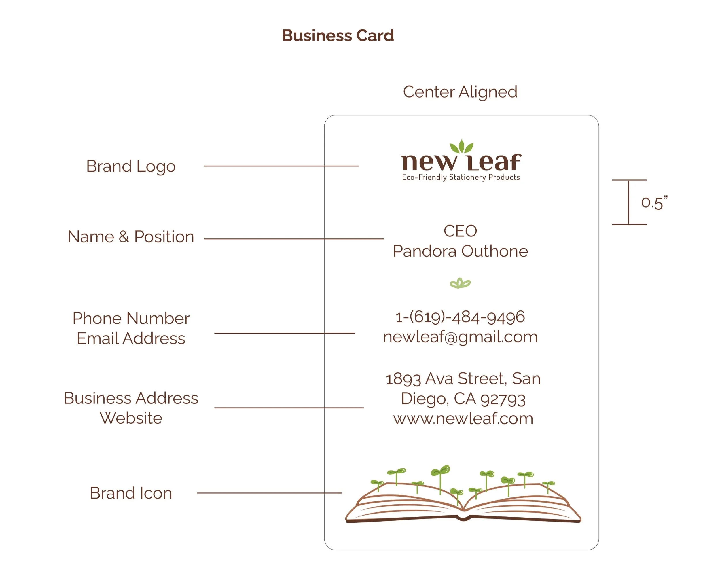
Contact Information Lock-up
Logotype Variations: Do’s
The logo is an integral part of the New Leaf brand and should be used consistently and thoughtfully. Often the logo will be displayed in color, however in advertising it may also be adapted for use as a fully black or white variation.
Using the Leaf Icon as a pattern or to represent the brand
Using the Leaf Icon in combination with the brand name
Adjustments to the brand logo color (Black & White or color)
Backgrounds
The following diagrams show examples of how the New Leaf logo should be properly used on the primary color scheme of the brand as well as variations in black and white. Avoid placing the logo on colors that are not a part of the main color scheme or a variation of the main 3 colors green, beige and brown. When used in advertising, the logo should be placed in an open space and not on top of any patterns or busy backgrounds.
Brand Typography
Philosopher
Dosis
Mukta
Color Palette
The use of earthy & natural colors to express the idea of being eco-friendly.
C: 23.83 M: 23.05 Y: 65.23 K: 0
C: 42.97 M: 69.53 Y: 77.34 K: 48.83
C: 52.73 M: 16.02 Y: 100 K: 0.78
Icons/Graphic Elements
Use it
This first icon represents the first “step” of stationery use (which is to utilize the products!).
Plant it
This second icon presents the action of planting the used notebooks.
Grow it
Once the used product is being planted, you just need to watch it grow!
Patterns

Brand Stationery System
Stationery Products
Reusable Canvas Pencil Pouches
Notepads
Reusability
Adjustable Binder Rings
One of the main products within the brand, are reusable and adjustable binder rings. The idea behind this is that once the journal or notebook etc. is used up, the customer is able to buy new seed paper to refill the product itself or just reuse the binder rings for their own stationery. This allows a type of freedom for customization to make the product more personal as well as allow customers to be more interactive with their items.
Coptic & Japanese Stab Binding
The idea of including these two types of book binding to create various stationery products is that it adds a very handmade feel to the product. The choice of using the Japanese Stab Binding was also chosen because of the nature of the structure. The binding allows and makes it very easy to remove and add paper to the book without damaging the cover and the rest of the paper within.
Marketing Collateral
Website
Promotional Items
Reusable Pencil Pouch
Refillable Pens
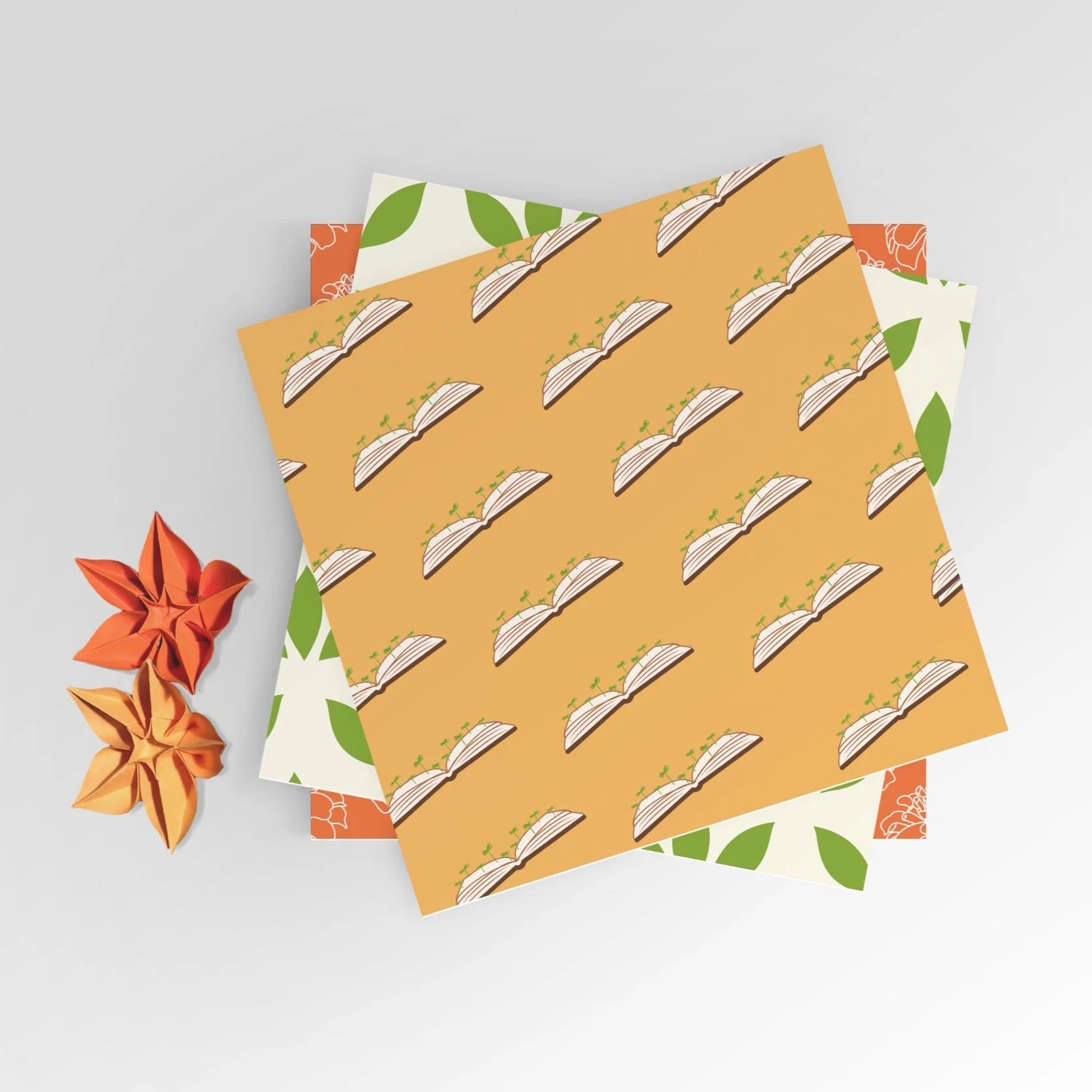
Origami Seed Paper


